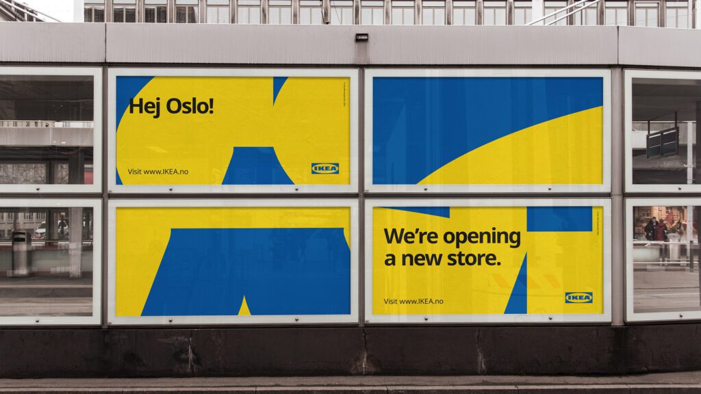
To mark the opening of its new city store in Stockholm, IKEA needed to make a bold graphic statement in the urban landscape. By using familiar and historical shapes connected to IKEA, we created a playful yet confident presence throughout the city, engaging with the local community in a fresh and unexpected way. The result became a global design system for opening city stores.
IDEA
The concept was centered around shapes similar to the logotype, using it in fragments to reflect the dynamic energy of urban life. This reimagined identity helped IKEA connect with an urban audience, showing how a global brand can reinvent itself in a modern city.
ATTENTION
The fragmented design appeared across construction fences and other city elements, grabbing attention through its familiar yet new design. By transforming the shapes, IKEA created a visual impact that felt both recognizable and surprising.
DESIRE
The design system integrated IKEA into the urban fabric, making the city store more than a shopping destination – it became part of city life. This approach projected confidence, creativity, and connection to Stockholm’s pulse, making the store desirable not only for its products but for the urban experience it provided.
MEMORY
The campaign left a lasting impression by showing IKEA’s ability to innovate and stay relevant. The design became a symbol of the brand’s willingness to rethink tradition and engage with a modern audience, cementing IKEA’s role in Stockholm’s cityscape.

