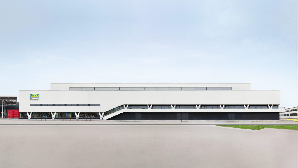
The Great Exhibition has a longstanding relationship with the IKEA Museum, delivering a wide range of creative and design services, from exhibitions and communication to products and retail. The goal has always been to create an immersive experience that allows visitors to fully engage with IKEA’s legacy and brand.
IDEA
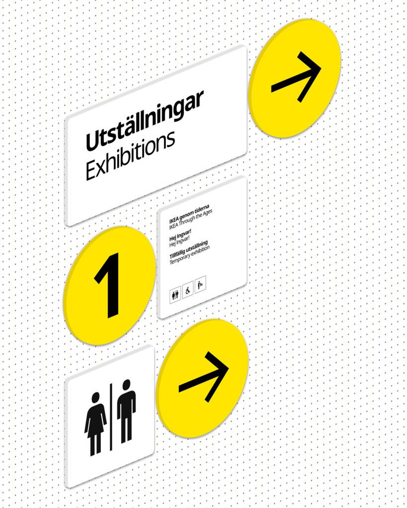
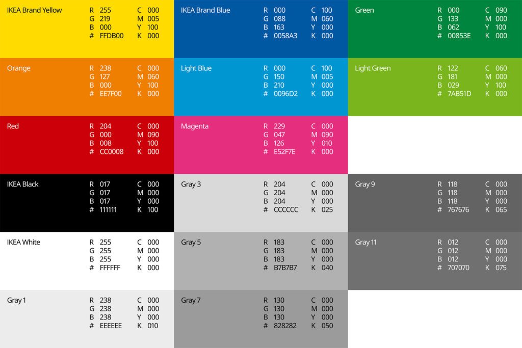
The identity of the IKEA Museum builds on IKEA’s established visual language, with a distinct addition that reflects its museum environment. The design focuses on ensuring the museum identity feels like an extension of IKEA’s core, while emphasizing museum-specific experiences—from exhibition design to wayfinding systems.
ATTENTION
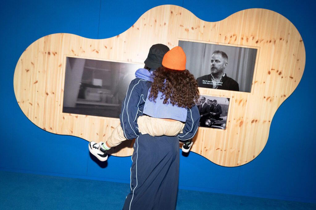
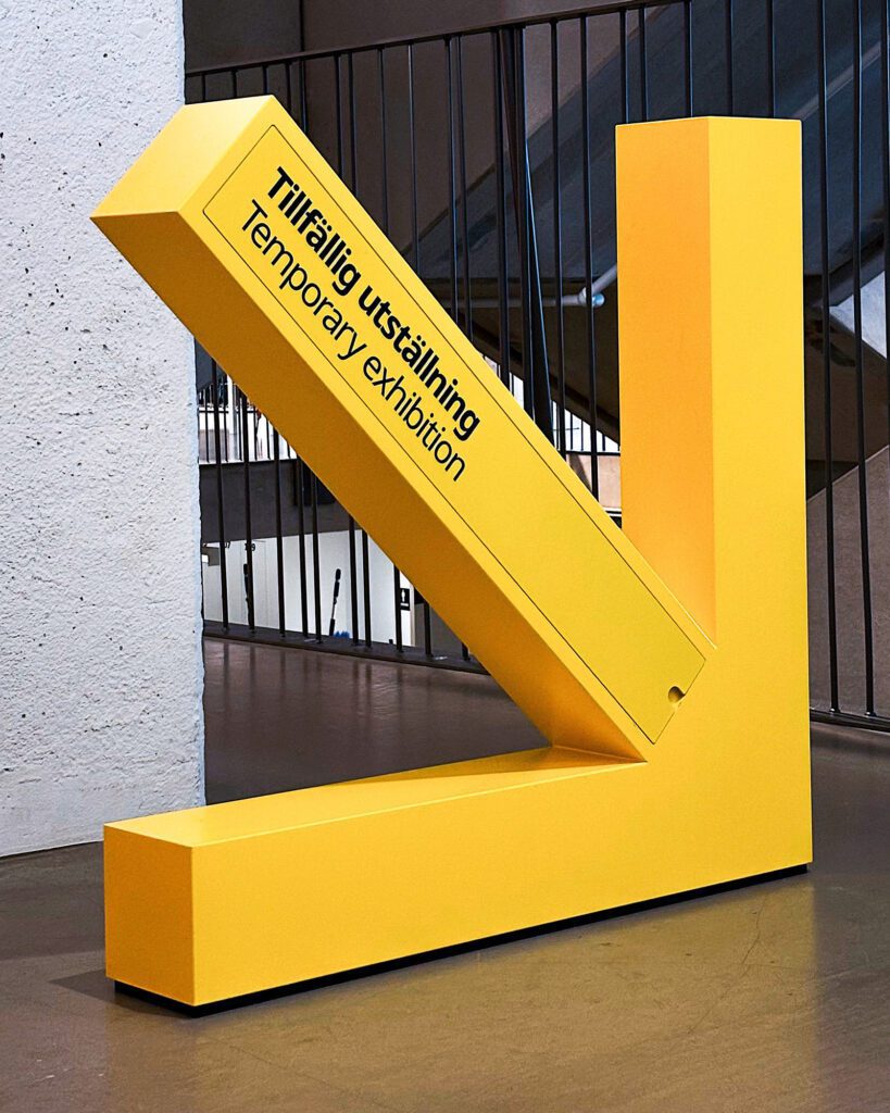
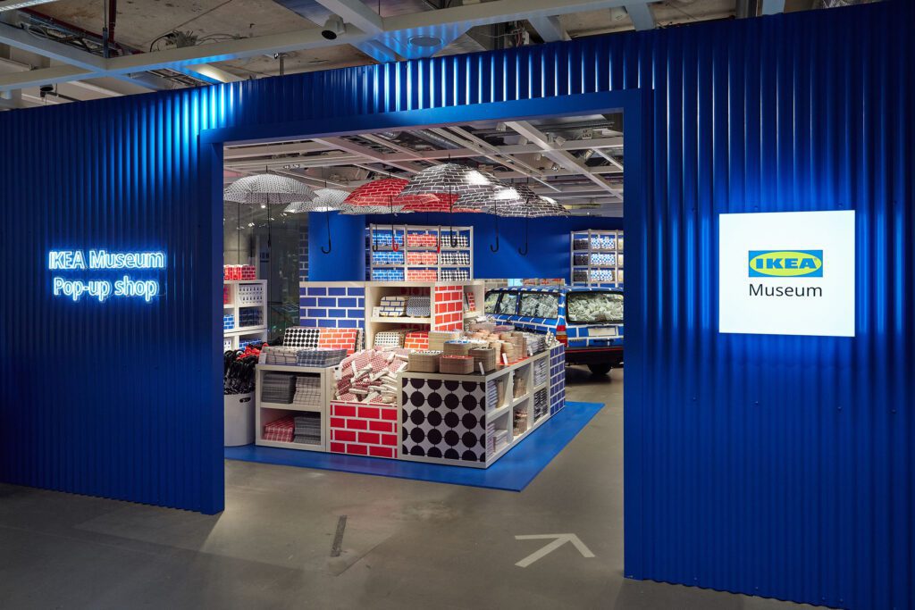
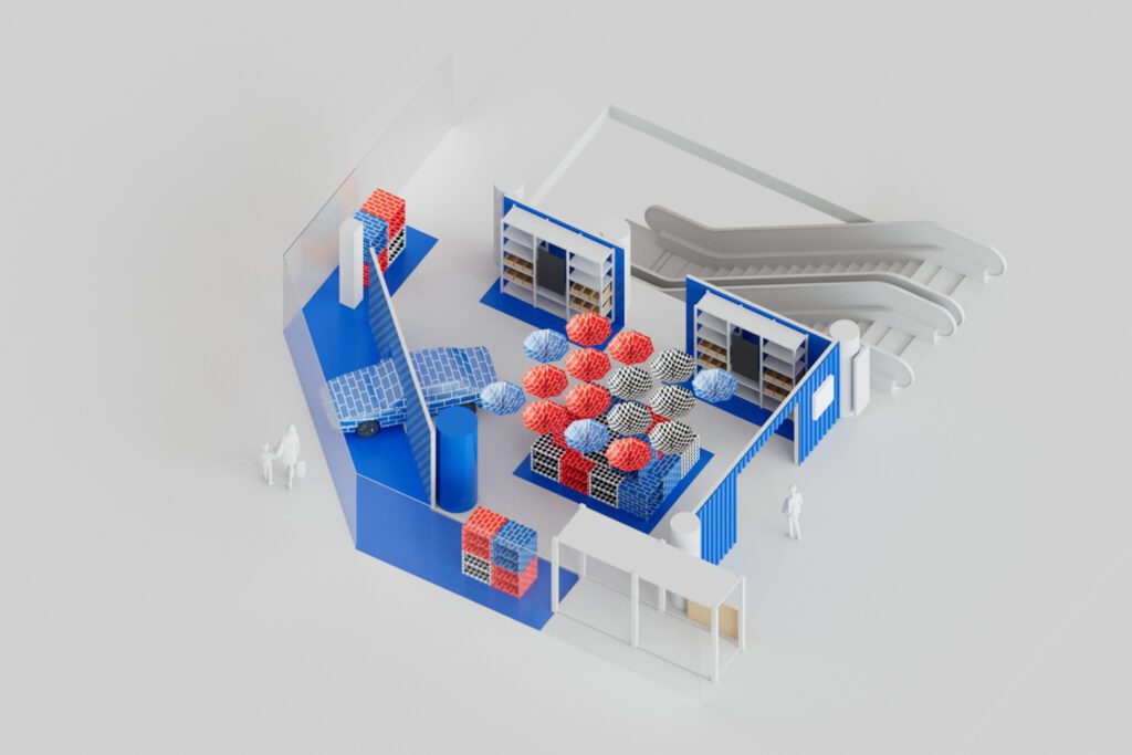
The use of bold colors and visuals ensures that the identity stands out while remaining connected to IKEA’s brand. The design work includes key visuals, signage, and digital displays that guide visitors through both permanent and temporary exhibitions. The museum’s pop-up events, such as the one in Gallerian, bring the IKEA experience into new spaces.
DESIRE
By designing a cohesive visual system, The Great Exhibition has helped make the IKEA Museum a destination that not only educates visitors but invites them to engage with IKEA in a new, more personal way. From the design of the restaurant to pop-up exhibitions, every element encourages visitors to interact with IKEA beyond the traditional retail environment.
MEMORY
The museum’s design brings together everything IKEA stands for
– functionality, playfulness, and accessibility. Whether through temporary campaigns or the museum’s permanent collection, the experience is designed to leave a lasting impression, reinforcing IKEA’s brand while adding layers of playful commenting on cultural and historical depth.


