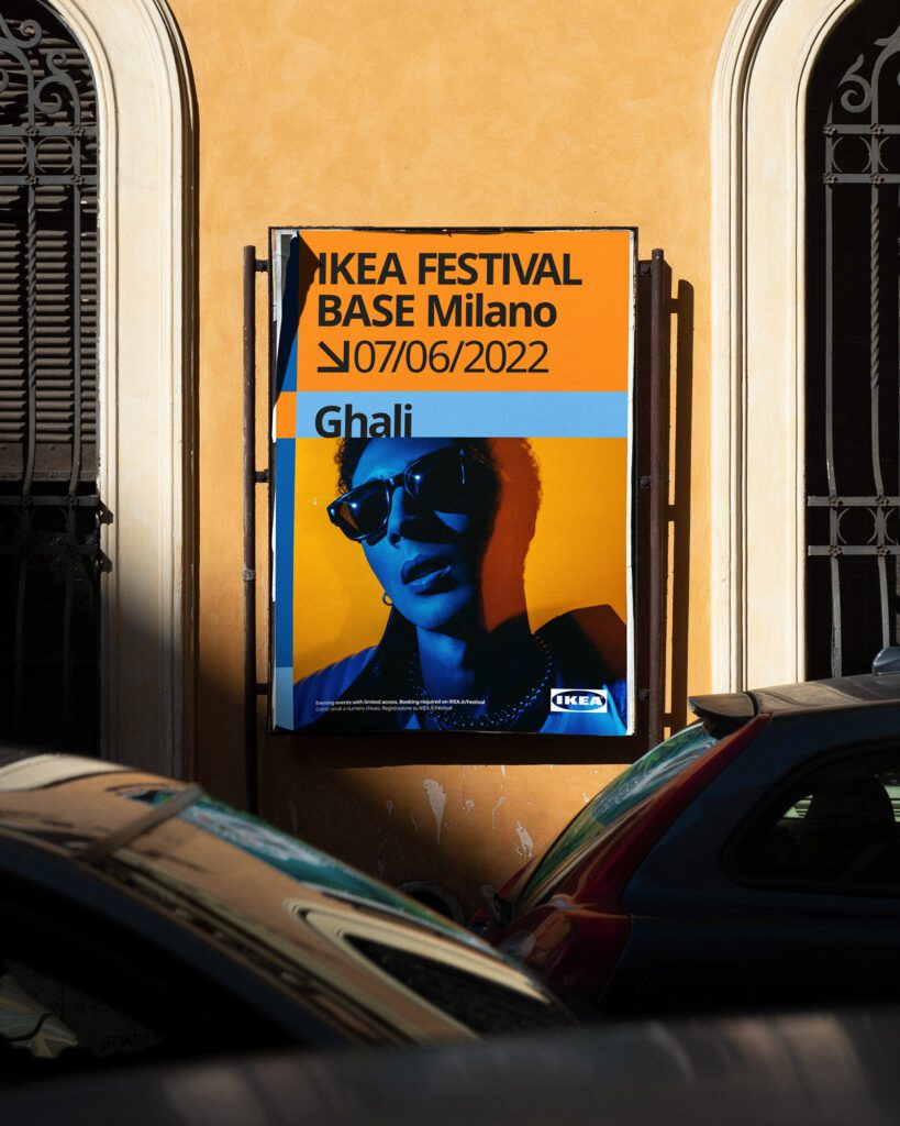
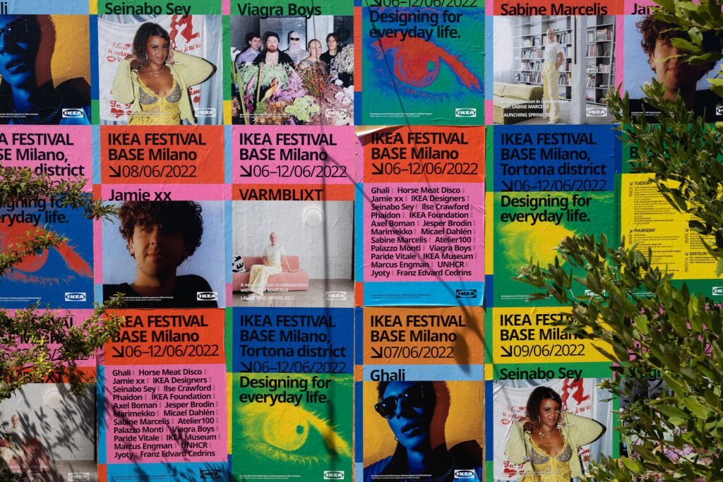
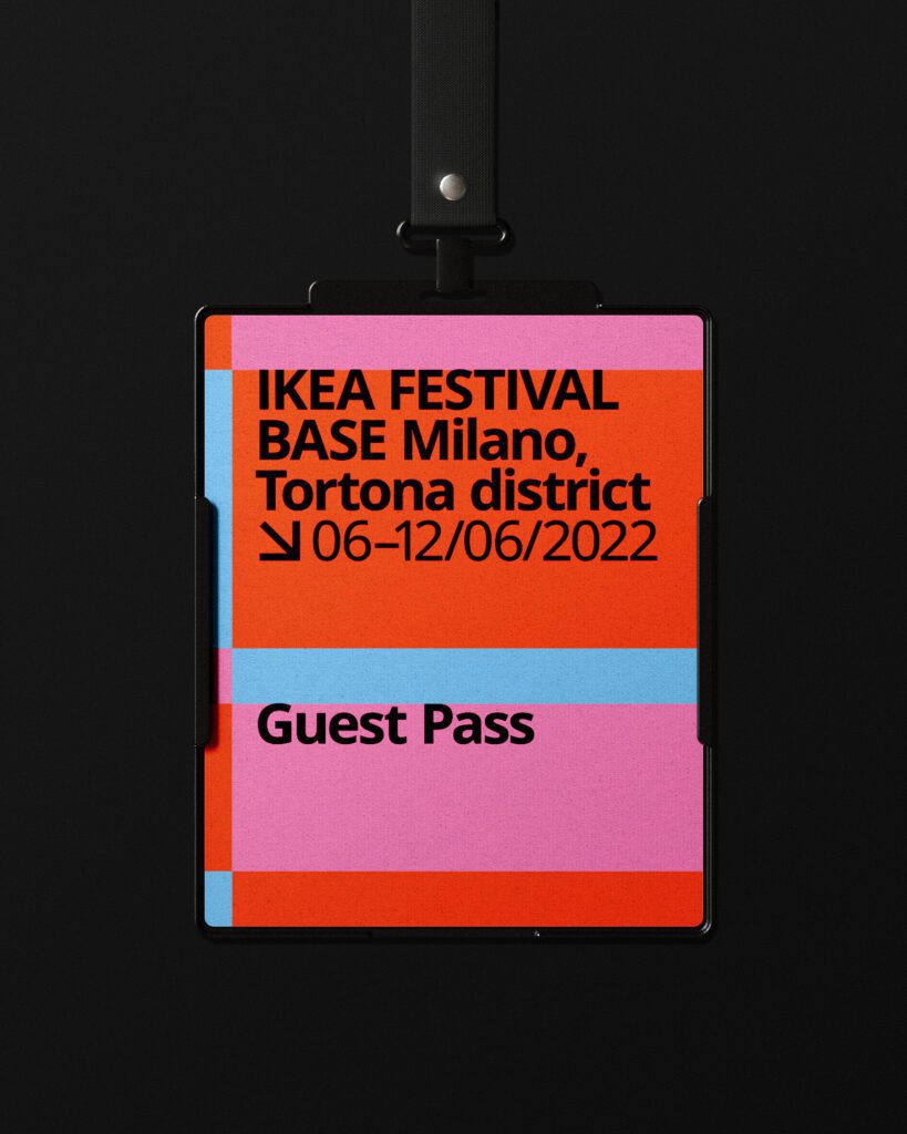
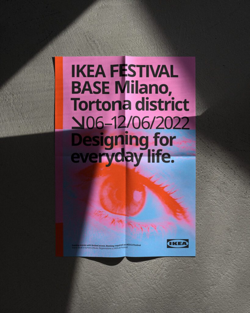
IKEA aimed to democratize Salone del mobile, introducing a fresh and engaging way to tell their story. We created a flexible grid identity that adapted seamlessly to various formats, mixing a strict grid with unexpected content to make IKEA’s presence at Salone truly memorable.
IDEA
We blended tradition with modernity, breaking the norms of Salone to show that design can be both playful and inclusive. IKEA’s presence was transformed into something dynamic and fun, making an unexpected impression.
ATTENTION
By infusing popular culture into IKEA’s identity, we turned the typically formal Salone del Mobile into a vibrant, festival-like experience. The grid system allowed for flexible, eye-catching content, drawing in audiences and sparking curiosity.
DESIRE
The colorful, dynamic design made IKEA feel accessible and exciting. The visuals invited engagement, encouraging visitors to explore IKEA’s story in new and unexpected ways, fostering a deeper connection with the brand.
MEMORY
The campaign reshaped IKEA’s identity at Salone, proving that democratic design is more than just an idea – it’s a feeling. The vibrant design allowed IKEA to resonate deeply with the audience, leaving a lasting impact.


